
Thursday, December 10, 2015
Friday, December 4, 2015

Thursday, November 19, 2015

Sunday, October 25, 2015

Friday, October 23, 2015
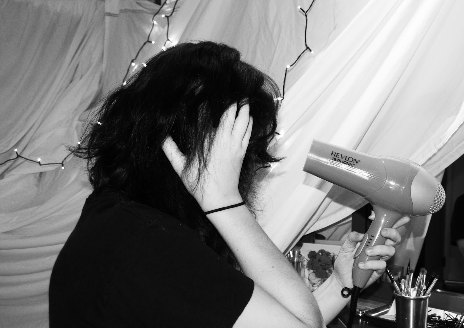
Polar (#8)
 |
| Top: SS:1/25, f-stop: 3.0, ISO: 200 Bottom: SS: 1/25, f-stop: 3.0, ISO: 200 |
When I first saw the assignment description I hadn't come up with any ideas immediately. After thinking about it for a while, I was still stumped because I didn't want to do sun and moon or earth and sky. I wanted something that could be a cohesive piece with elements of similarity as well as opposition. I though about what things contain contradiction and solidarity. I thought of myself, and the way I present myself, and the way I feel internally from hour to hour. Finding the opposition within myself was not hard. I could be soft and someone vulnerable in a situation where I am observed for my looks, such as walking into a room or class. This part of me is there, aware of judgements, but still confident in myself. Then I thought of my gym, and the way I feel when I workout, especially when I box. I feel a sense of agility and almost grace. Being somewhat new to this, I lose balance or mess up on form and I feel stupid, but continue. I feel powerful and strong because I know that I can get better. Stumbling and losing focus or stance, hitting the bag wrong and hurting my wrist, or whatever the mistake might be, is a reminder to me that I can improve. Allowing myself to feel vulnerable while I fight is similar to allowing the feeling of insecurity in social situations. I know that I am beautiful, and I know that I am strong. These emotions and sides of myself present themselves not only in boxing or new social situations, but in almost every situation that I experience in my life. Feeling beautiful and strong, or intelligent and capable can allow me to acknowledge my internal poles of self. I am one cohesive piece, one mind, and one body.
For the execution of this concept as it translates to photography, I had to accentuate these sides in physical representations. To do this, I wanted to find the best way to exaggerate these ideas. For the idea of vulnerability and beauty, I wanted to find a look that could represent this appropriately. Many factors went into creating a photo that expressed this. I wanted a pose, facial expression, and hair and make up look. Also, I wanted a simple background that could be transferred to the boxing photo for a smooth transition and congruity. For this, I had to find a balance of colors that could work with the lighting that was available in the photo studio. After setting up the backdrop, lighting, and camera, I put on more dramatic make up (like deep lipstick). Then, using a self timer, I took several photos in different poses. For the boxing photo, I used the same setup, but changed my physical look. I put on a hoodie, but my hair up, removed my make up, and put on my gloves. I had to find a different pose that illuminated the essence I had envisioned. So, I chose to hold my hands in fists in front of my face, which is crucial in boxing (to protect your face while boxing). I then chose a more intimidating stare for the completion of my appearance.
The last step in this project was to edit the photos. I first edited them separately to do touch ups. I created a cleaner and sharper image. I cleared blemished, cleaned up edges, and darkened and lightened certain things. Then I converted both images to black and white, raised the contrasted and vibrance, and adjusted curves. I then followed the instructions to put them together. Once they were side-by-side, I adjusted brightness and curves again to ensure the composition was as similar as possible. After that, I had the complete project.
Monday, October 19, 2015
Color to Black and White


I chose the method of manually moving the saturation all the way to zero. From there I used some other adjustments to create the final image. I changed the curves and contrast because simply changing the color image to black and white did not make the image I wanted with enough depth or intensity. After trying all of the methods, I still picked my favorite, mostly out of convenience. However, now I know how to do things differently while also playing with hues and greyscale.
Monday, October 12, 2015


Friday, October 9, 2015
Art as photography
 |
| final |
 |
| original |
 |
| inspiration/original painting |
This project turned out to be incredibly difficult. When I originally chose the photo I though it might be a simple recreation, but there were a lot of components that were crucial to the photo, that when changed, take a lot away from it. I found that to be especially true as I tried to recreate it. Some situational circumstances changed my ability to take the photo with the best light/background but nonetheless I find that I am quite disappointed in this. I still tried, and I do feel I put in a great effort.
Wednesday, October 7, 2015


Friday, September 25, 2015


Thursday, September 24, 2015
7 days
Day 1:

Day 2:

Day 3:

Day 4:

Day 5:

Day 6:

Day 7:

For all photos:
SS: 1/50, f-stop: 3.2, ISO: 200
adjusted curves (up by bottom), vibrance (-24)
Wednesday, September 23, 2015
Light (as.#6)
 |
| SS: 1/50, f-stop: 5.6, ISO: 400 Adjusted curves, brightness (lower), contrast (higher), vibrance (higher), saturation (slightly higher), also cropped. |
 |
| SS: 1/50, f-stop: 5.0, ISO: 200 Adjusted curves, brightness (lower), contrast (higher), vibrance (lower), saturation (lowest) |
 |
| SS: 1/200, f-stop: 5.0, ISO: 200 Adjusted curves, brightness (lower), contrast (higher), vibrance (higher), saturation (lowest) |
 |
| SS: 1/50, f-stop: 4.6, ISO: 400 Adjusted curves, brightness (higher), contrast (higher), vibrance (slightly higher), saturation (slightly higher) also cropped |
The hardest part about this assignment was adjusting my camera. As a person who only recently started using manual (used auto for 3+ years) and only just now started a photography class, getting the hang of adjusting the f-stop, shutter speed, and ISO is pretty difficult. However, I feel more connected to my work because I feel like I am making it the way it is, not my camera. It allows me to further understand my camera and how different parts relate to each other, but also how to adjust a camera for the appropriate situation. In my mind, the picture of the flowers was the most successful. The image alone had good depth and clarity but I was able to draw out those qualities and exaggerate them to create a better image. In general, understanding the influence of light and how to control it with my camera has allowed me to become a better photography, although I still have a lot to do.
Thursday, September 17, 2015


Tuesday, September 15, 2015


Sunday, September 13, 2015

Wednesday, September 2, 2015
Composition (assignment 3)

(SS: 1/100, f-stop: 4.0, ISO: 200)
With this photo, I somewhat used rule of thirds, I could have done better with it. I think that the lines from the shutters lead to the subject, allowing it to be clear. It is also simple, which allows the main aspects of the photo to become more clear.

(SS: 1/100, f-stop: 4.2, ISO: 400)
With this photo, I tried to frame the subject between the panels, which brought out good composition. This also allowed for the photo to be more or less symmetrical. Although the background is, there is one subject, in the center pain of the window.

(SS: 1/50, f-stop:4.5, ISO:200)
This photo, to me, has strong composition because of the focus on the eyes (primarily right, which is centered) and the simplification. The subject is clear, and there aren't any factors to distract from that.,The background is simple and consistent. The subject also fills the frame.
Thursday, August 27, 2015
Texture 101

shutter speed: 1/100 sec, f-stop: 3.5, ISO: 200

Shutter speed: 1/500 sec, f-stop: 6.3, ISO:200
(not my photo)
Photo found on: https://sammysamsphotography.wordpress.com/2014/11/24/i-dont-even-know-how-to-use-this-website-anymore/ name: Sam?

I chose this photo because from browsing other photographs with texture components, I felt this instantly. The second I saw this photo I felt it, and more than that, It is stunning. After going to the post by the artist, there were more photos of the cat's nose, and all were amazing. I appreciate the simplification of the black and white because it allows the viewer to focus entirely on the texture and feeling. Whether you have a cat or not, I think that anybody can relate to the texture of a common thing taken for granted. By getting close, the artist highlights the beauty and simplicity in a cat's nose.
Tuesday, August 25, 2015

Saturday, August 22, 2015


Thursday, August 20, 2015

Subscribe to:
Comments (Atom)